UX&UI / Design Thinking / User Research / User Journey / Prototyping
The app „What I Eat“ aims to make healthy eating more understandable and easier to implement.
The user enters all consumed food into the app, thus filling out the food pyramid. This way the user gets the feedback which food he/she consumes often or less. In addition to the pyramid you get feedback through understandable statistics and motivating sentences.
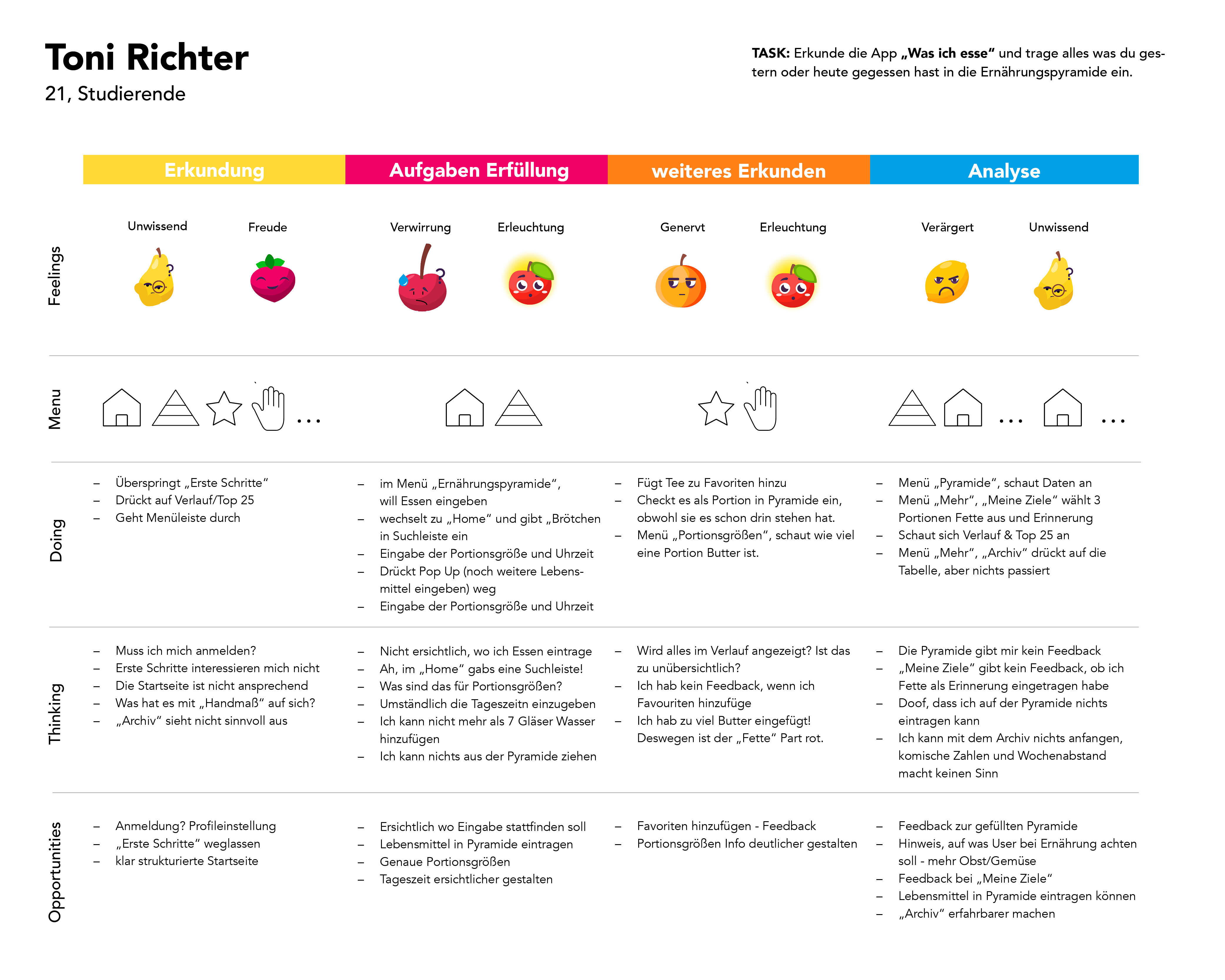
User Journey
We redesigned the app called „What I eat“. Therefore we wanted to see what can be improved and started a user testing. We have recorded the results in a user journey map, which is shown below.
Key Screens
From the results we found out that, for example, entering the pyramid is not obvious to the user. We then translated the findings into key functions and built them into the app. Here you can see the master screens with our most important functions.
01 Food pyramid
On our main screen you can see the food pyramid. Here you can enter the food you have eaten. You get an overview of your diet and daily motivational feedback.
With the Streak, we want to motivate users to fill their pyramid every day. The Streak is supposed to represent a flame. It only burns if you fill the pyramid every day. The number of streaks increases every day and users should therefore remain motivated to keep the flame burning.
02 Inserting Food
We wanted to make the input process easier. So we added food categories and favourites for foods that you eat more often.
03 Streak Here you can see a weekly overview of your streak. Besides it shows the portion sizes which you need to get the streak. This is a playful and motivation feedback.
04 Statistic Heat Map
With the heat map we wanted to create a visualisation for the user to see how much of what kind of food they ate. Every column is a category of food. The saturation shows the increasing portion size. The slider can change the time period, so the user can see their food recordings in different dimensions. By clicking on the day you get a feedback on how much you actually ate that day. A exclamation mark shows if the amount of food was too much depending on your health conditions and body.
Design Principles It was important to us to set design principles. These design principles helped us to set a consistent visual design but also remind ourselves what we learned with the user testing and how we can incorporate it in the application.
They consist of Health, Comprehensibility, Structure and Individuality.